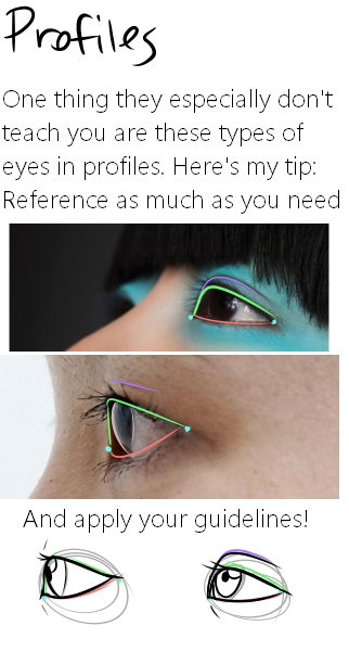
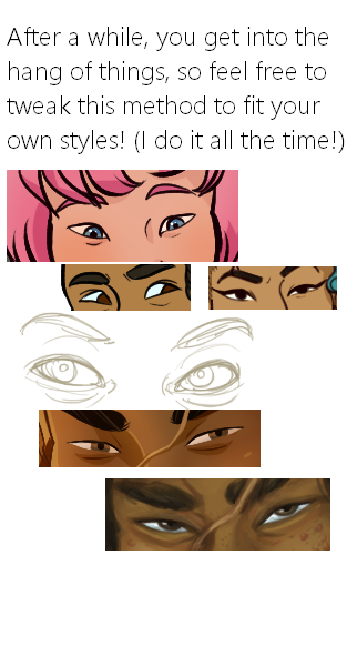
Here it is, my long winded tutorial, complete with some step by step action. I see a lot of people talk about wanting to diversify their artwork but not knowing how. This is my help to you. You really should take the time to invest in learning diverse eye shapes as diverse artwork always makes you a better artist. And frankly I’m really tired of drawing tutorials that talk up character diversity but only have the stereotypical “one Asian eye”.
I did some step by steps for those three diagrams, but I actually got them from this blog which has 14 of those examples! (Bonus: it’s a makeup blog so if you need help with that or want some idea of how to shade these eyes, there ya go)
Art is hard and you never cease to learn something new everyday. There is no artist that hasnt encountered a wall, dont turn around, climb it. Believe you can.
For those wondering about HOW to do this, here’s a short explanation according to me:
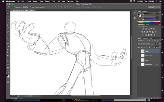
Drawing A to Drawing B: -the most obvious change is the exaggeration of the line of motion in the character.
In Drawing B the line of motion is much more pronounced, creating more drama and movement to the whole composition
-The arms are open wider, showing more confidence and exuberance in the character, exaggerating their emotions so they can be more clearly read without having to look to the face for emotional cues.
-the legs are wider apart, adding to the aforementioned confidence but also giving the character a solid foundation, visually speaking.
-The head is tilted back and overlapped by the chest, adding a touch of dynamic perspective to the drawing.
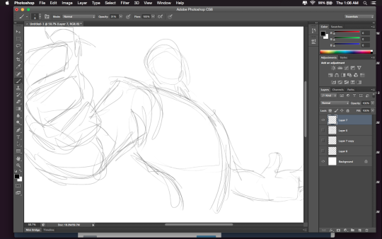
Drawing B to Drawing C: -Most obvious change is to zoom in on the character. Character framing is just as important as what the character is doing. Zooming in can help infensify emotions. this shot is ALL about this character and what they’re feeling. -Because of the zooming in, the arms/hands would have gotten lost, so instead of making the canvas wider, the artist has elected to rotate the character slightly, bringing a dynamic angle to things and more intensity to the close shot. -While the character is more upright in this shot compared to Drawing B, in Drawing C the chest still slightly overlaps the neck, preserving the feeling of being slightly below the character (putting them in a position of power relative to the viewer), which helps maintain confidence and power in the character. -the chest is exaggerated to carry the majority of the body’s line of action so even though you cannot see the legs, our brains are able to fill in the gap and envision that line of action. -The cropping/framing of the character allows for a more interesting composition/negative shapes created by the positive (character) on the negative (background), creating more visual interest as well as a circular motion to the composition through the arms, across the face to the negative space for the eyes to rest in before dropping to the hand in the background and back through the composition again.
DID YOU DISSECT MY DRAWING TO FIND OUT WHY IT WORKS?? I LOVE YOU. I LOVE YOU. THANK YOU SO MUCH
THERES THIS WEBSITE CALLED IRADUKAI AND ITS FUCKIN AMAZING BC VARIOUS JAPANESE ARTISTS POST THEIR STEP BY STEP ON FINISHED WORKS STARTING FROM SKETCH UP TO FINISHING TOUCHES
IT ALSO SAYS WHICH ART PROGRAM THE ARTIST USED FOR CONVENIENCE PURPOSES YEAA
ITS IN JAPANESE THO BUT ITS MOSTLY IN PICTURES SO ITS NOT TOO HARD TO UNDERSTAND
YOURE WELCOME
I just tried this out and found process images of artworks I’ve admired for years!
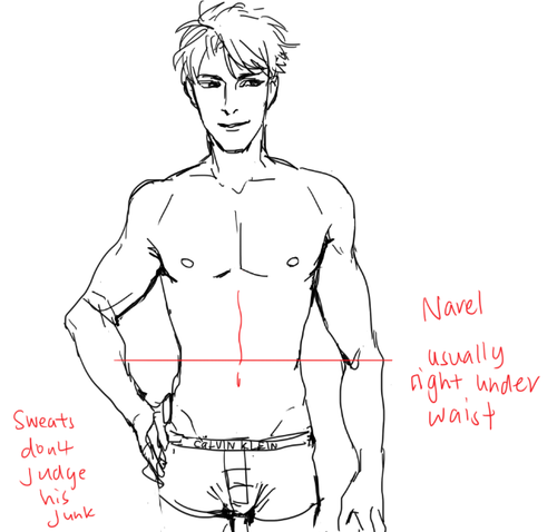
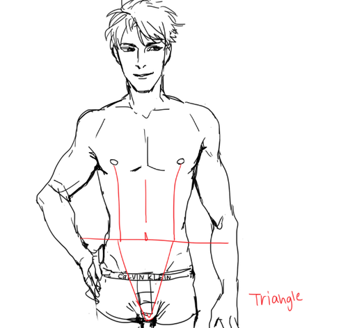
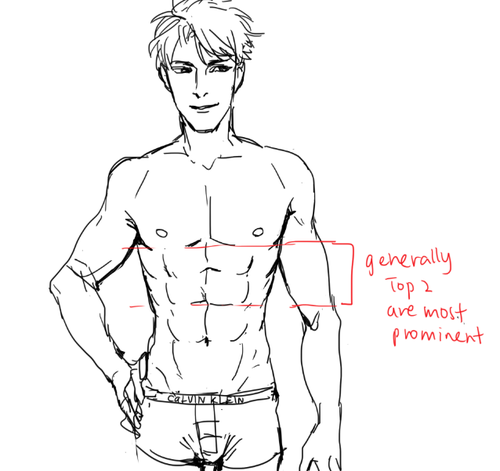
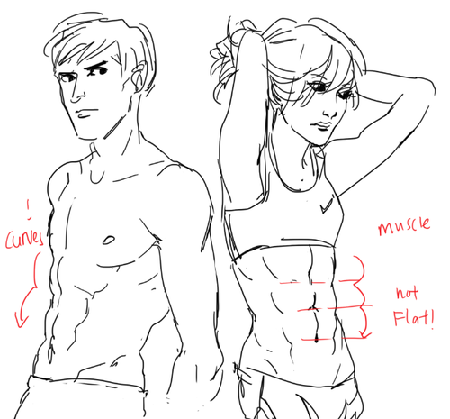
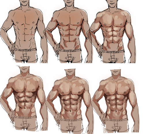
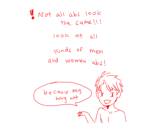
I STILL TAKE A LONG TIME TO DRAW OK looking abs HHahA SOBS AND LIES DOWN but yeah!! GO LOOK AND Some real life abs i promise you it’ll be ten times more helpful than my crude doodles!!
PLS TAKE THIS WITH A GRAIN OF ASALT AND Hope this helps u out a little!!