Kyle T. Webster shared a small pack of free Photoshop brushes!
if you’re using an older version of Photoshop, you may have to convert the .abr file using abrMate. you can also use abrMate to export the brush tips as .png files for use in different programs, but you’ll have to fine-tune all the brush settings yourself, and many programs, like Clip Studio Paint, lack some features such as Dual Brush so they won’t behave quite the same as they do in Photoshop.
It’s basically a massive database full of high-quality images of different hairstyles. I mean, look at all the options in that sidebar (and part of it’s cut off):
In total they have 976 pages of hairstyles with about 17 styles each, that’s about 16592 hairstyles to look at.
The Closer Look: While this channel is primarily dedicated to the story telling in movies that doesn’t mean you can’t translate a lot of these story telling mechanics into writing. The video in the link covers how to make a compelling villain with one of my favorite villains of the DC Universe, so give them a look.
Extra Credits: Just like the last entry, this one doesn’t have much to do with writing novels or fiction. Rather, Extra Credits covers game design a lot of the time. But they also cover how to write the stories for those games and offer some interesting insight. Couple this with their other segments Extra Sci Fi and Extra History, and you have the makings of an amazing tool kit for writers of any medium.
Overly Sarcastic Productions: There is not enough praise I can throw at this channel. Anything from Trope Talk to Miscellaneous Myths and even Classics Summarized is able offer something to even the most seasoned writer. Just like Extra Credits too, they also cover a bunch of historical stuff too. Which, as a history buff myself, is always a plus.
Tale Foundry: By now, i’m sure you’ve gotten the theme. All of these channels are amazing, but this one is more writing focused then the rest thus far. The channel dedicates itself to taking a closer look at genera and sub-genera and the big players therein. It gives the audience a chance to take a look at these things under the microscope for an easier means of dissection for their own work.
Hello Future Me: I found this channel when I was scrolling through YouTube randomly and found their video on Writing a Hard Magic Systemand it gave me plenty of food for thought on the fantasy novel I was working on. They go on to cover a Soft Magic Systemwhich was able to really draw the line in black and white as to the difference between the two. From there, the channel has been able to offer a few good videos on matters of writing fiction and one that comes with a recommendation for me.
PlagueOfGripes: This one, you’ll need to take with a grain of salt as the host is a little rough around the edges. While he primarily covers art streams and other shenanigans like that, he did a three part video essay on writing that had quite a bit to teach. I personally found his cynical nature to be charming and funny, but if that isn’t your thing, maybe pass him by just this once.
All the links to the channels are located in their respective titles.
Masking fluid is, essentially, liquid rubber. It adheres to the paper and protects an area from watercolour. When the paint dries, you simply remove it. There are different types of masking fluid, like the ones you apply with a brush. But if you’re like me and want to cut the crap with RUINING BRUSHES: look no further. I exclusively use Molotow masking liquid pens now.
You don’t need sacrificial brushes. It’s tinted blue so you can see where the hell it is. The future is here.
Rolls on like a kickass pen
Let it dry, slap on your watercolour
Coax it off with an eraser
Bam look at that. Perfect for those details you want to stay white. Not recommended for application over large areas. Available on Amazon.
some tips and tricks that have seriously helped me in excelling at watercolour
1.PAPER WEIGHT. for the love of god do not use any paper under 110-120 lbs to paint with watercolour, a very VERY wet medium that will soak clean through the paper if it’s not thick enough (most paper pads sold at craft stores have the weight listed on them. printer paper is around 20 lbs, sketch pads will be about 60 lbs, IDEAL watercolour paper 140 lbs+). i use only 140 lb paper for my serious watercolour works. canson and strathmore are my favourite brands
2. there’s no need to have very expensive watercolour paints, but it is important to use something better than crayola. my dad gave me a 24-pan windsor&newton watercolour set when i was 8 and these are still the paints i use today (i was a very careful child, but i never even had to replace my paint pans after almost 10 years either, so this brand, while super expensive, lasts and earns my gold star.) some other cheaper options are: x and x
3. if you’re going to be using watercolours, prepare to use WATER. so many people forget this, but it’s so important to realise this media is meant to look translucent, so you should see the paper through the paint. if you can’t see it, then you’re using the paints as if they’re gouache or acrylics, so try using more water and work with lighter colours.
OKAY NOW FOR THE ACTUAL TRICKS
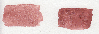
4. SALT
quite overused in watercolour but it’s so freaking cool it can be pardoned. *remember for all of these effects, you have to use lots of water with the paint for it to work!
5. ALCOHOL/VODKA/HAND SANITIZER IF YOU’RE LAZY LIKE ME
you have to be very careful here because the second image can turn into the first if you use too much alcohol and it soaks through the water and paint gets in the spot, so be sure to experiment plenty before using this!!
but yeah you can use whatever clear alcohol you can find and it does p much the same thing
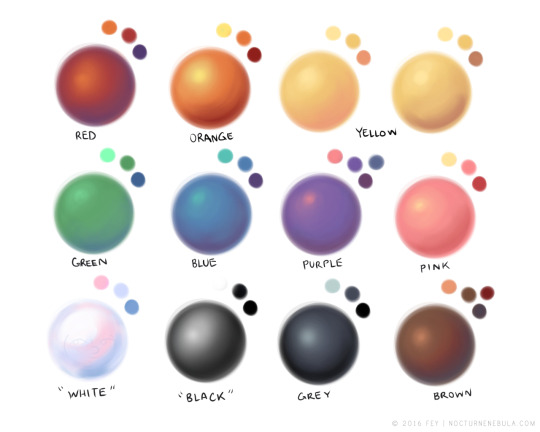
6. LIGHT SKIN TONES
okay while the darker skin tones are more easily achievable with browns and additional yellows/blues/reds to bring out the undertone, light skintones are hard as hell to make with watercolour because it’s hard to even think of what to mix. think no more!
YELLOW OCHRE + ANY PURPLE = perfect skintone you can play around with. adding more of yellow or purple will give you either cool or warm skin tones you can build up on and layer until they’re the proper value. remember to use purple/cool shadows with skin in compositions with normal lighting!
7. PAYNE’S GREY
and finally to repeat my previous post, use PAYNE’S GREY instead of black for a richer, darker colour in your painting. don’t use black unless your entire composition has warm colours, but even then, try to use a very dark brown instead of black.
8. WHITE
finally, it’s very important to mention this: never use the white watercolour they sometimes give you. EVER. EVER. dilute your paint with water instead to get a lighter value, or else you’re not using watercolour to its full extent (which is something you might struggle with if you’re used to using acrylics or oil)
—
that’s all i can think of at the top of my head, but if you have any questions or need further brand recommendations etc, feel free to message me!
These are some quick notes. If you’ve got questions about shading/colors lemme know I’ll edit the original post.
When making a piece I always want to make sure the overal rendering is good. Eyes are drawn to contrast. When you pick your colors make sure there are enough pleasant hues, enough contrasting values, and ENOUGH SATURATED AND DESATURATED COLORS
When you choose to do high saturated flat colors make sure your shadows and lights are desaturated. If you make your lights warm make your shadows cool. For values always check if your piece still looks appealing under a black and white gradient filter. If not, bump up those values! If your piece looks fine in black and white but trash in color HANDLE YOUR SATURATION.