read read read read read until you’re swollen with words. read advice from every author you love and read advice from every author you hate and read advice from the monster under your bed and read grammar books and read books from the black mountain poets and read books from modern poets and read self-published novels.
and once you’re filled up on ideas other people have given you, ignore everything you just were told and write what you want to read. if you’re absolutely in love with the luminous quality of alliteration, use it. if you’re amazed by the ability of adverbs to astonishingly and quickly multiply, flood your page with them. if you want to let every character die and come back to life, let them. if nobody dies and it’s 500 pages of people in a tea parlor talking, you just wrote a longer version of “no exit” by jean paul sarte and tbh it’s looking for an update.
the reason i end up hating my work is twofold. either i’m stuck and it’s just a writing block and it doesn’t flow like it needs to, or i’m stuck because i’m too worried about perfection. i need a passage to ring perfect, and i get so caught up in silly things like commas and splicing and never using “said” that i can’t put anything down without feeling like i’m slogging through letters. i forget that the best part of writing a book is how fun it is to write a book. how caught up i get in the story, how sometimes i can even make myself laugh with surprise.
write because you want to hear yourself tell the story. write with a good sense of humor, honestly. i’ve written five novels, and while they’re not for publishing, they were for fun. we forget not everything has to be marketable and serious. that the best part of writing is when you evaporate and everything becomes story.
and when you’re just blocked? go back to the first part of this. and read.
I did a class on this recently through Laneway Learning and I promised I’d post the hand-out I gave at the end of it, so here it is. Thank you to Karithina for being my editor! This is for new artists and experienced artists alike, because drawing a lot does not mean you’re necessarily good at it. You are never above going back to the basics, ever. Complacency is your enemy.
I want to point out, first and foremost, that the “artists are born artists” or “only right brained people can be artists” beliefs are absolute bullshit. The brain is intricately linked to both sides, and the idea that all people are more dominant on one side than the other has been scientifically proven to be incorrect.
This is good news for you! Because it means literally anyone can be a master artist, all it takes is a lot of practice and research, like literally every other skill in life. I hope you find this helpful!
—-
The methodological order of learning the basics:
Forms and shapes
They make up literally everything. You can be good at anatomy and perspective but still draw things very flat looking because you lack understanding of how forms and shapes work.
Perspective
Drawing forms and shapes in different perspectives helps you understand perspective in a more simple way. Start with them, then move onto more complicated shapes.
Composition
Draw the forms and shapes in different arrangements, orders, etc. Research different compositional arrangements and their effects.
Colour theory
Learn it and learn it well; then apply on all the above basics. Colour theory also includes lighting.
Anatomy
Anatomy of all forms are comprised of a series of forms and shapes, so it’s imperative you understand them first before moving on to anatomy.
Anatomy doesn’t need to be done last; it can be done between forms and shapes and perspective, but it can be daunting for new artists so I usually leave it until last since it is a rather complex subject.
Life drawing
Life drawing is imperative to the improvement of every artist. It is best to start by using lines and no shading for objects that are simple shapes such as mugs, jars, candles, etc. Once you’re comfortable with this, start drawing the same objects but shade them. Despite being simple shapes, these objects contain complex reflections and they will help you understand how light and reflections work with different surfaces.
Play with composition. Draw the same objects in a different arrangement, or in different perspectives – otherwise you’ll rely too heavily on muscle memory, which will restrict the diversity of your technique. You need to understand how objects work in 3D space, not just how it looks from specific angles. Once you’re comfortable with this, add colour. Rinse and repeat with this method for more complex scenes and objects.
Remember: when drawing from life, try to visualize the negative space around the objects and draw the “lines” using that; drawing from silhouettes, once you learn how to do it, is a very effective way to ensure proportions and shapes stay correct.
Reference, reference, reference
Draw from your imagination but always use references. It is not cheating. Every professional artist uses references. You cannot rely on remembering exactly how things look; your mind erroneously fills in the blanks for you.
Make sure you research the copyright restrictions on the images you use for reference if submitted anywhere. Give credit where credit is required, and when in doubt always ask the artist first. Master studies should always have credit given, even if the artist died hundreds of years ago. For quick reference checks like seeing what way a belt buckle goes, google image does the trick and no need to give credit there for something so small.
Influences and originality
Be influenced by a large number of things and artists. Being original isn’t the most important thing, as long as you’re happy with what you create. But to ensure you’re not merely copying what other people do, mix it up. Experiment. Try a large variety of styles. You’ll find that all of them will eventually find a place in yours. Style is one of the things that comes naturally. If you wish to do commercial art – for games, movies, etc. – it’s important to be able to be stylistically diverse, too.
One of my favourite stylistic exercises is drawing something a few times from life, then condensing what makes up that object’s primary feature’s and exaggerating them, like a caricature. E.g:
Your style is very unique to you, and I would suggest that if you are unhappy with it, perhaps instead look where your art is lacking on a technical level. That is usually where the problem lies.
Tutorials
Be wary of the “how to draw [insert object here]” tutorials, only use them for inspiration once you understand how lighting and perspective works. They only teach you how to draw like somebody else. Instead, I suggest you find photos of said object, or the object itself, and draw it from different angles, and in different lighting. It takes a thousand attempts at drawing something to master it, and that’s the same with any skill in life.
Warm up before diving in
Before diving into drawing, do warm-up exercises: draw 30 circles on a page really quickly, sketch some quick figures (such as http://www.posemaniacs.com/thirtysecond), or draw some squiggles, shapes, flashes from your imagination, so on so forth. You use muscles when you draw and they need warming up like any other muscle in your body, otherwise lines will come out more stiff than what they could be. Also, always remember to take breaks!
Lastly, remember: everyone learns differently. I learn very well from following things in exactly one order, but that doesn’t work for everyone, and that’s okay. Don’t feel guilty about switching the order up a bit. Experiment and find what works for you, whether that is video, live models, books, livestreams or physical mentors.
Personal improvements after following this advice
I’ve been drawing my whole life; I’m 26. But I stubbornly insisted I was good just because I drew a lot. in 2014, I decided to actually learn the basics- some 22 years into my drawing experience- because I was unhappy with where my art was at. Here are the results.
Best thing? The new versions took less time by at least 2x, because I knew what I was doing. Not only that, but I planned my artworks- did texture studies and compositional thumbnails. This is very important to do for large artworks. It will save you HOURS.
Personal preference is not technically technical improvement. Learn to differentiate between the two. I deliberately chose to differ some aspects from their originals because the originals did not get across the feeling that I, personally, was aiming for.
Some resources
http://krita.org A free digital painting tool for Linux and Windows. It’s my go-to for all my digital art.
http://mypaint.intilinux.com/ A free digital sketching tool for Linux and Windows. I use it for all my line-art. It has no transform tools and some beautiful pencil brushes, imitating real media.
https://www.youtube.com/user/FZDSCHOOL/playlists Incredibly useful videos by Feng Zhu, a hugely successful concept artist who’s been working in the field for decades, and who also runs his own concept art school.
I always hear people complaining about how much better the piece looked digitally, SO, here is a run down on how to get prints that look more like your original piece.
First of all, every printer is different. Every paper is different. Make sure you take the time to do test prints and become familiar with how your printer and paper combo work, as you’ll rarely nail a print your first try. This one took about 5 test prints before I was confident to print on the expensive large paper Every time I mess up on a print, I save the remaining paper to use as scraps for test prints.
As you can see, the original piece looks very nice! The focus is super strongly on the tiger, and all of the vibrant colors are still super evident in the background. That said, when I print it as is, everything about 85% gray or darker turns BLACK. And this is high quality paper designed to get accurate vibrant colors, too.
The best way to fix this is to do layer effects. Brightness/contrast is my favorite, as a typical piece will generally print about 5x better if you up the brightness to around 15-25, and adjust the contrast up or down by 5-10 points. That said, if you have a HIGH contrast piece (Darks against brights) like this one, you typically need to do a few more steps.
Often I’ll do a second brightness/contrast adjustment layer and push brightness to an obnoxious level so the darkest darks are closer to a mid-dark range. From there, I’ll create a mask and use a transparent gradient tool to slowly pull back the brightness on all of the lighter areas of the image.
Additionally, due to printers using CMYK and your screen being RBG certain colors just physically CANNOT print. Some people will always work in CMYK because of this, but honestly I like my saturated colors and most of my work is intended to be seen digitally so I only ever work in RGB. Photoshop has a nifty toggle (Ctrl + Y) where you can toggle between CMYK and RGB view to see how your piece will appear when it prints. It’s useful to check this because if you worked in a color that cannot replicate in print, you may want to shift it entirely before you even bother printing.
Artwork tends to desaturate a bit as it prints, so I’ll often make a Hue/saturation layer to play with, too. In this case the image was already pretty damn saturated, BUT some of the shadows on the tiger were printing more brown than orange, so I adjusted the saturation a bit to keep them vibrant with the rest of the image. **DO NOT use “Lightness” to lighten your image! It basically adds a white overlay to your image. Always use Brightness, instead.
After all of that, I have a final print that much more closely captures the essence of the original painting. I could have tinkered even more, but to me the goal is a good print rather than an exact copy.
For ULTRA high contrast images, like a dark room looking out into a snowy exterior, expect to do a LOT of adjustment to get it to print correctly. Printers just aren’t too fond of super darks right up against super lights.
I could make a proper tutorial on this if people request it. Mostly, just wanted to put my thoughts down in one spot!
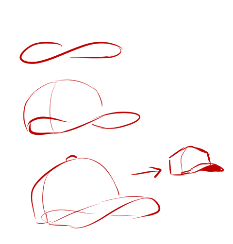
@amacing3 I’m not the best with tutorials but I can try and show some of my shorthands for how I draw hats! I use a kind of figure 8 loop as a quick gesture whenever I’m doing hats to help me get down the curve of the bill.
I have a tendency to make all my caps look more angular like trucker hats just because blocky shapes are easier for me personally haha.
Some other points I remind myself of whenever I draw hats! Draw through your figures to make sure it “fits” properly and follows the contour of the head/direction they’re looking. Typically, the bill meets the crown at a slight angle unless it’s a snapback or something.
And my last super important helpful hat tip!!!!!! Get a hat irl and take pics of yourself wearing it for reference haha~
ahh thank you so much! ♥ welcome to the digial art scene friend, i hope you enjoy your stay and ctrl + z
now onto your question! (if you don’t know what layer and layer modes are and how they generally work you should probably google that before you continue reading)
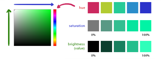
we all perceive colour differently (thx science) and i trust my intuition a lot when it comes to colour picking because of that, and also because i feel like you can make pretty much every colour combination work within the right context. context is key! but still, remember that all of this is about how i perceive colour, so you might not agree with everything i say.
here’s a quick rundown of terms you’ll see around a lot in reference to colours and shading: the hue, which is the ‘colour’ itself, the saturation aka the intensity, and the brightness [or value] which describes how dark or bright we perceive a colour to be.
rule of thumb: when you shade don’t just add black (or white) to your base colours, that will make your drawings boring and lifeless. use different hues and saturation!
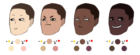
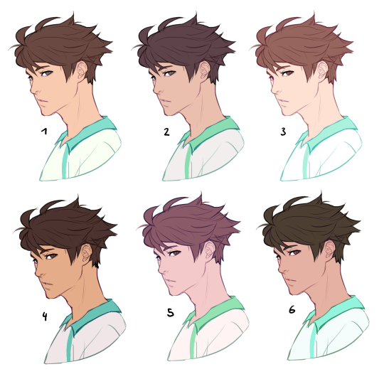
now first things first: which skin colour does the character have?
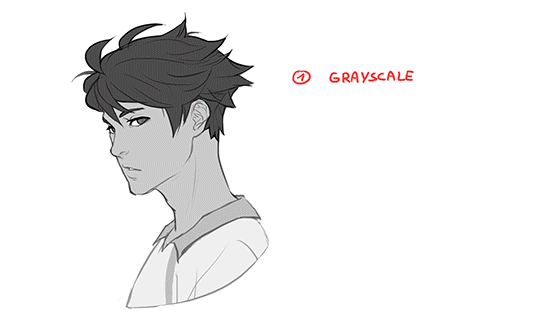
you’ll mostly be navigating in the red to yellow spectrum for the skin tone. so when i pick the base colours i usually start with the skin and adjust the rest of the colours accordingly. if you’re not sure where to begin it might help if you first determine the values (brightness) of the base colours in grayscale.
and here are a few colour variations—i stuck to the approximate values but played around with a lot of different hues and levels of saturation.
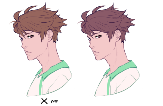
now compare 3 and 5: you’ll notice that 3 is very bright and leans towards orange hues, whereas 5 has a pinkish tint.
on the left i gave 5 the hair colour of 3 and in my opinion the pink hue of the skin doesn’t go well with the orange undertone of the hair. you’ll have to experiment a lot to find out which combinations work for you.
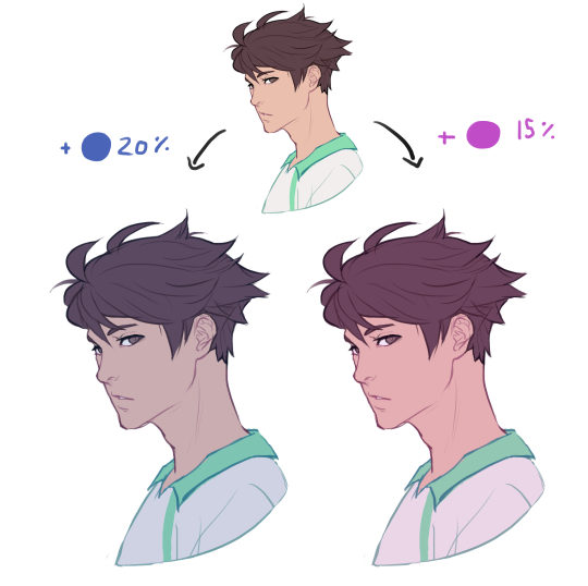
ctrl + u is your biggest friend (or image >> adjustments >> hue/saturation in photoshop, the shortcut works in sai and clip studio paint too). play with the sliders and see what happens. i do that a lot myself, because it’s easier to coordinate the colours like that afterwards instead of trying to manually pick perfectly matching ones right away.
for further adjustments i like to use an extra semi-transparent layer on top of everything with just a single colour to add atmospheric light. this unifies the colours and makes them more harmonious, if that’s what you’re looking for. this is about as far as i’d go if i didn’t want to shade the drawing.
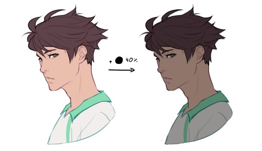
if i do want to shade, especially with high contrasts and dramatic light, i darken the base by just adding an additional black layer, here set to 40% opacity. of course you could add a colour layer like the ones i mentioned previously too.
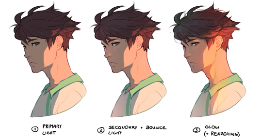
to create an impression of dramatic light you need a high contrast between light and dark areas (1). if i want additional visual intrest i often add secondary light which falls onto the main shadow areas. here i picked a faint greenish blue to balance out the yellow (2). and since light is at least partially reflected when it hits a surface you should add a faint glow that goes across the shadow/light border (3).
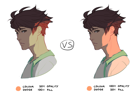
for this shading style i like to use the layer mode colour dodge with lowered opacity + fill settings. for some layer modes opacity and fill do the exact same thing (e.g. for multiply or screen). however for colour dodge there’s a big difference:
a lowered opacity merely alters the transparency of the entire layer. that looks pretty awful sometimes, because the bright orange affects the dark of the hair much more intensely than the already brighter skin. but when you lower the fill percentage you primarily lower the amount of light that falls onto darker colours. so the layer’s opacity setting treats every colour equally whereas the fill setting takes their values into consideration. it might be hard to understand if you don’t try it out yourself, so just play around to get a feel for how it works!
and to summarise, here’s a process gif:
colour is an extremely big topic and i’ve only barely scratched the surface but i hope that still helped you out a little! the fastest way to learn is always to try things yourself, so grab a sketch and experiment. 👍