My ability to proofread increases by 1000% after I hit “Submit”.
this is often because when you’ve submitted something (like fanfiction to ao3) it will be in a different font, size and framing than in your word processor. The text will look different in the new environment so your brain stops skipping what looks familiar (like a typo that has been there since the beginning).
So, tip: revise your work in a different font and size. I guarantee you’ll catch more typos and mistakes than otherwise.
For all my writers (ones I follow and the ones that thankfully follow me)
I always re-read everything before posting as a draft on AO3, and I literally sometimes rewrite entire sections of fics that I hadn’t thought about twice while editing in Google docs.
It’s not just grammar/spelling, either, I find looking at it on another page and in the way it’s going to appear once posted helps me analyze for clarity/wording as well!
Reblogging for artsy people that follow me. Also a lovely name for a program.
I WAS JUST WANTING TO DRAW SOMETHING WITH MY NEW TABLET BUT I COULDN’T BECAUSE I DIDN’T HAVE A PROGRAM TUMBLR IS READING MY MIND!!!!
I’m really fond of this program so far. It may be a bit over-simplified – I’ve had trouble figuring out some really basic things – but it responds really well to my tablet, which is the most important thing.
It launches fast. Works well on Windows AND Mac. It’s perfect for fast or derp doodles and screencaps. It has guides which are awesome for helping with drawing perspective and uniform direction lines It even shows you pretty artwork in its dialogue window at startup for inspiration. IT’S AWESOME.
For those who don’t know:
THE ALPACA HAS LEVELED UP
-Has an Animation Mode (OnionSkin mode) using the layers as frames -Reference Window -Advanced Brush settings and editing -New Filters such as “Invert”, “Extracting Lines”, “Cloud”, and “Sand” -More snap tools, including a 3D perspective function
And the younger sister software, Medibang Paint Pro, is a more robust version that’s usable on not just Computers, but Android and iOS systems as well
-You can save your preferences, workspace, brushes, palettes, and materials if you have a Medibang.com account, and you can export/import them across different computers if need be. -Medibang is a lot like Pixiv or DeviantART, except you can become a published illustrator and/or Comics/Manga artist, regardless of where you’re from in the world -Medibang allows you to upload directly to their site as long as you have an internet connection -You can collaborate with others on illustrations or comic projects using the cloud saving system -Free brushes, screen tones, and background images available for download from the cloud, for use in your artwork
Testing with WINE after download. Will update soon.
Update: Wine can handle it quite reasonably if my inexperienced ass does say so itself (yes, I did actually test it, but none of the animation or intensive features), so fellow Linux people? HAVE FUN!
Wandered into an article with 140 iconic cinematic shots, the comments complained there was no explanation to their composition. Decided to give it a run down and keep it to myself.
The compositions are mostly self explanatory but I wanted to see what patterns I could find. That’s just how you learn stuffs.
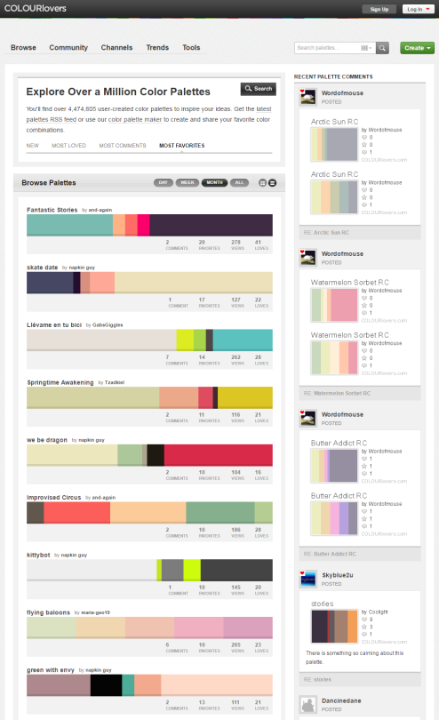
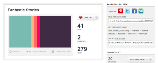
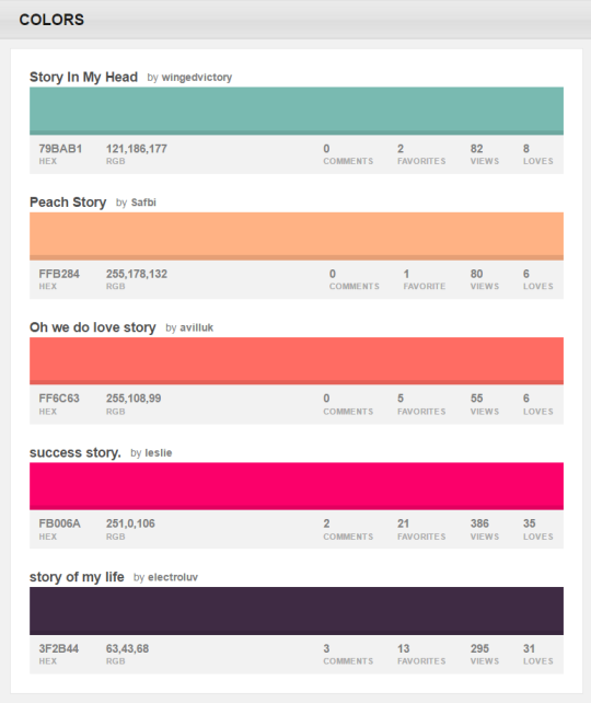
You can browse the most popular ones or search for certain colors, themes, and even specific hex codes!
When you find one you like, you can download a wallpaper swatch of it and also select the specific colors it uses to look at more palettes that use those same ones.
Guys, I keep seeing that post going around about putting uncooked spaghetti noodles in your tablet pen to work as replacement nibs, and I know OP means well and stuff, but PLEASE DON’T DO THAT.
Pasta, no matter how smooth it is, is still a product of dry flour, and rubbing it down on a surface creates micro-sized grit that will scratch up your screen faster than any tablet nib, and they wear down even faster, so it won’t even be worth it. Also, it’s so brittle, if it breaks inside the pen, it will be difficult to clean it out.
Tablet nibs are a pain to replace and buy, but buying a 10 pack of them for $7-8 on Amazon is going to be a better choice than having to pay a heftier sum to repair a scratched up tablet surface/screen.
Spread this post if you can, because I’d really hate to see someone accidentally damage their tablets this way.
[Drawing of a green elephant saying “The art in your sketchbook doesn’t have to be perfect or even good. It can just be for fun or practice.” in a light blue speech bubble.]
Poses: use posemaniacs or quickposes,
do 1 min gesture drawings daily, do 10-5 min studies. Use dynamic
pose refs (like dancing, fighting, etc.) Make sure you know where the line of the spine, shoulders and hips are placed! If you can identify that on a ref, it’s easier to start! Here are some 1 min drawings I did just now:
They don’t have to be overly detailed! But analyse them and find out what you need to improve!
Hands: you can do the same with this
page. Look up hand tutorials, do style studies. Hands are tough, but
hands can be stylised very widely- maybe a more stylised comic-hands
tutorial makes you understand a hand better in the beginning?
What I’ve learned about hands (which
changed how I view them) is that the fingers/knuckles are not placed on a
straight line (sketch page bc what are words):
not v accurate rn but I hope it helps with visualising 💕
I don’t work at Cartoon Network any more. But I’m going to give you a very quick portfolio review in hopes that you find it helpful!
Here are some things I noticed when looking at your stuff – lessons I learned from brilliant people while working on AT for two years:
1) AVOID SYMMETRY. Humans are organic, randomly shaped animals. Perfect symmetry rarely exists in nature and if it does, it’s conspicuous – it’s the exception rather than the rule. Find interesting ways to throw your characters off-balance.
Don’t repeat objects in twos – (buttons or rips or whatever) – it feels prescribed – cluster things in threes or fives if necessary.
2) AVOID CONCAVITY – I don’t know what else to call this. But it’s those lines that go “in” rather than “out”. You are using inward sloping lines to describe many of your characters. As an exercise, try using outward, rounded, voluminous lines to draw EVERYTHING. Humans are fleshy lumps connected together by other fleshy lumps. Each mass is either in front of or behind other masses and as a designer, it’s your job to tell the animator where it is. As a designer, you are providing a technical blueprint for the location of masses.
Only occasionally allow a concavity to connect two convexities. Look at the work of Robert Ryan Cory (spongebob), Tom Herpich (Adventure Time) or Phil Rynda (AT / Gravity Falls) – master character designers – for examples of this. If you need to, trace a couple of their drawings and you will see what I mean.
3) AVOID GRAPHIC DETAILS – Some shows use a graphic style; it’s very appealing and looks clever when done right. But in animation, everything needs to move in space – so if you use a graphic element – it needs to correspond with an actual 3D thing that can move. Therefore it is better to start with a voluminous style and then revert to graphic elements where appropriate. Art directors will look for this. Do not jump straight to graphic representation if you do not yet know what you are representing.
Look at the work of Tiffany Ford and Jasmin Lai for amazing examples of volume expressed graphically.
4) STUDY JAMES MCMULLEN – To truly understand volume, and fully respect your subject, you should read very carefully High Focus Figure Drawing by James McMullen. Slow down and think about drawing “around” your subjects. It’s a truly meditative experience when you get there. Think about the weight and mass that your characters, props and effects are experiencing. Many students from SVA – Tomer Hanuka, Becky Cloonan, Rebecca Sugar, James Jean – studied under McMullen’s philosophy and you can see this common richness in their work.
Jeffrey Smith, a top student of McMullen’s now teaches life drawing at Art Center. These are two of the best illustration schools in North America – anyone who is interested in drawing living things, should probably read his book.
Also look at the work of Andy Ristaino or Danny Hynes – two other character designers’ whose work is seething with volume.
I hope this is useful and I hope you have a wonderful career.
So recently I came across a fellow artist who was struggling to find a free art program, and considering dropping the large amount of money for a Photoshop license. I know not everyone can afford such an expensive program, so I’ve compiled a list of programs with no cost to download and use.
Keep in mind all computers are different, so not all will work for everyone. Also, I’ve only ever used Windows, so for the most part, I’m not sure if everything will work for Mac. if in doubt check the website linked.